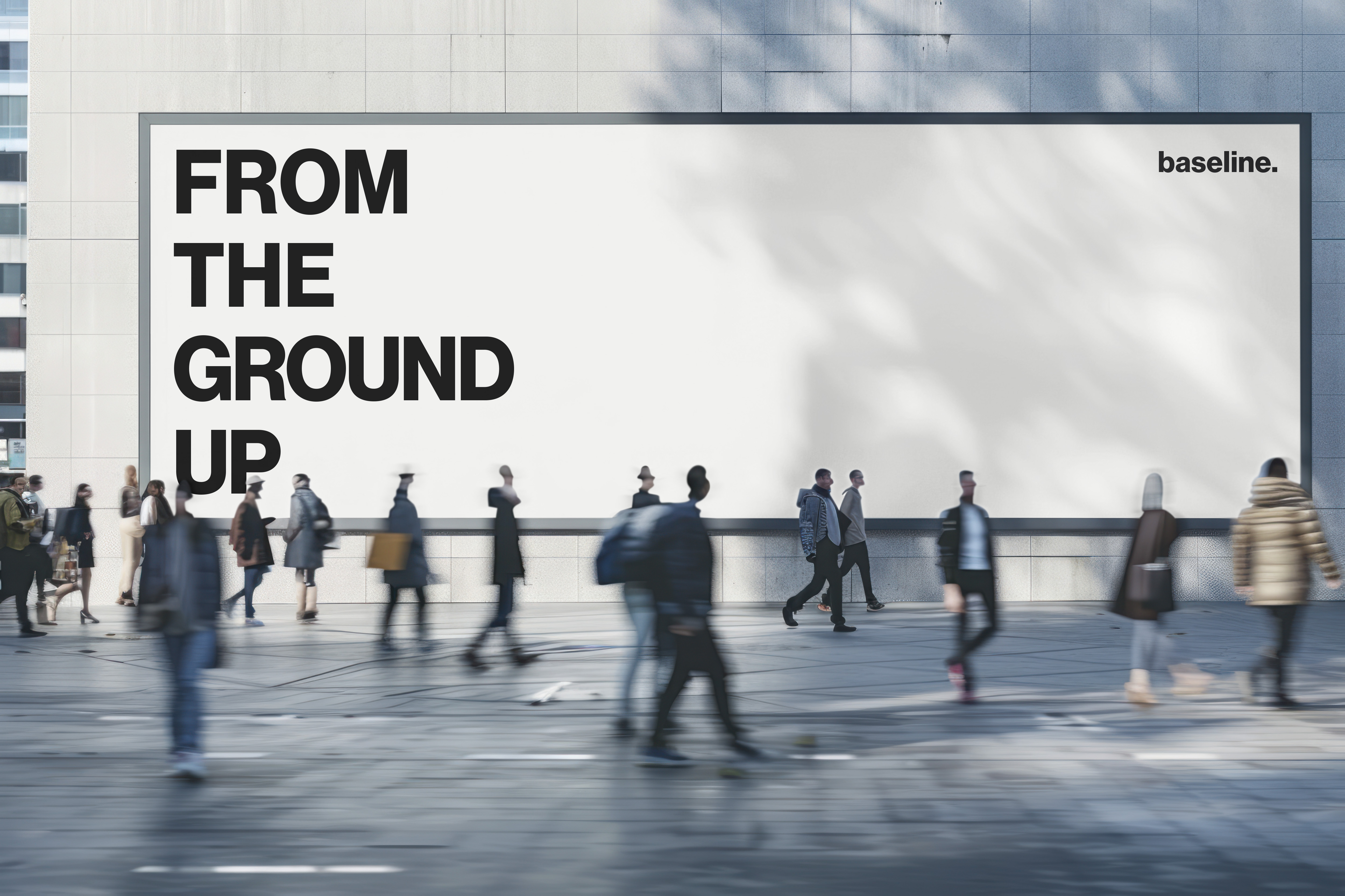
Studio Identity — 2025
baseline. is a Brisbane-based brand identity practice built around a single conviction: structure comes before style. The studio identity was built to demonstrate that principle from the ground up.
Most growing businesses build their brand visually before they build it structurally. A mark gets made, colours get chosen, and the system gets improvised around them. The result is an identity that fragments as the business scales, inconsistent across touchpoints, difficult to extend, and impossible to hand off.
baseline. inverts that process. Structure comes first. The identity was built as a modular system from the outset, one that could establish clarity immediately and absorb growth without losing coherence. Every decision was made at the system level before it was made at the visual level.
Primary mark, secondary mark, submark, graphic motif, typography system, poster series, digital application, business card, tote, social media system.
The identity is built on two principles: consistent spacing and deliberate repetition. A fixed outer margin anchors every layout, creating a spatial logic that holds whether the format is a business card or a billboard. Vertical stacking reinforces hierarchy without requiring additional graphic support. The grid is not a constraint, it is the identity.
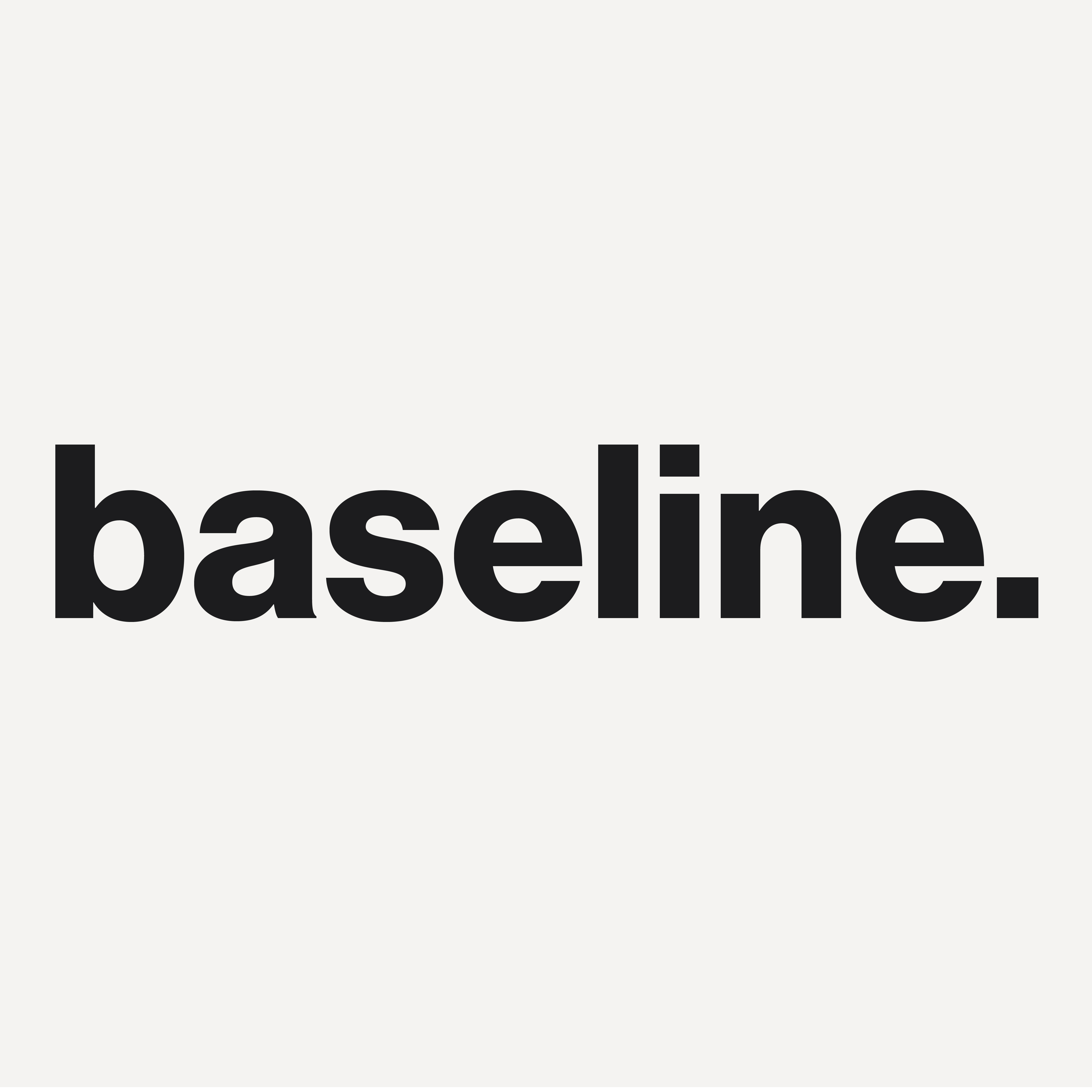
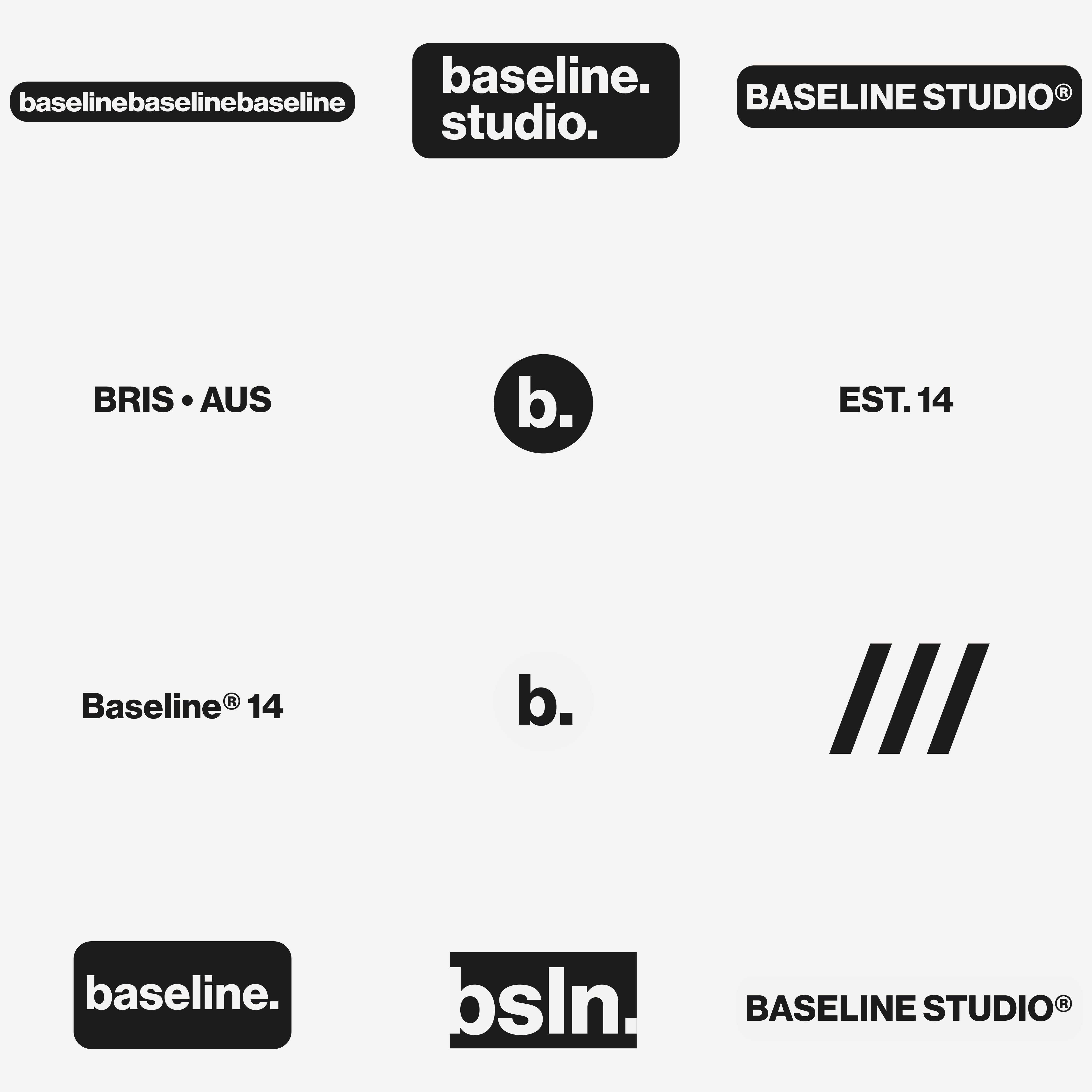
The system operates across four marks, each with a defined role and context. The primary mark carries full brand weight. The secondary mark and submark compress the identity for smaller formats without losing recognition. The graphic motif functions as a structural and navigational device, present throughout the system but never dominant.
Two typefaces, one clear division. Neue Haas Grotesk Display forms the expressive core, neutral enough to recede when the layout needs space, authoritative enough to lead when it needs to. IBM Plex Mono operates as a counterpoint, introducing a technical register that speaks to baseline's positioning as a system-led studio. The contrast between the two is deliberate: warmth and structure, expression and precision, in the same breath.
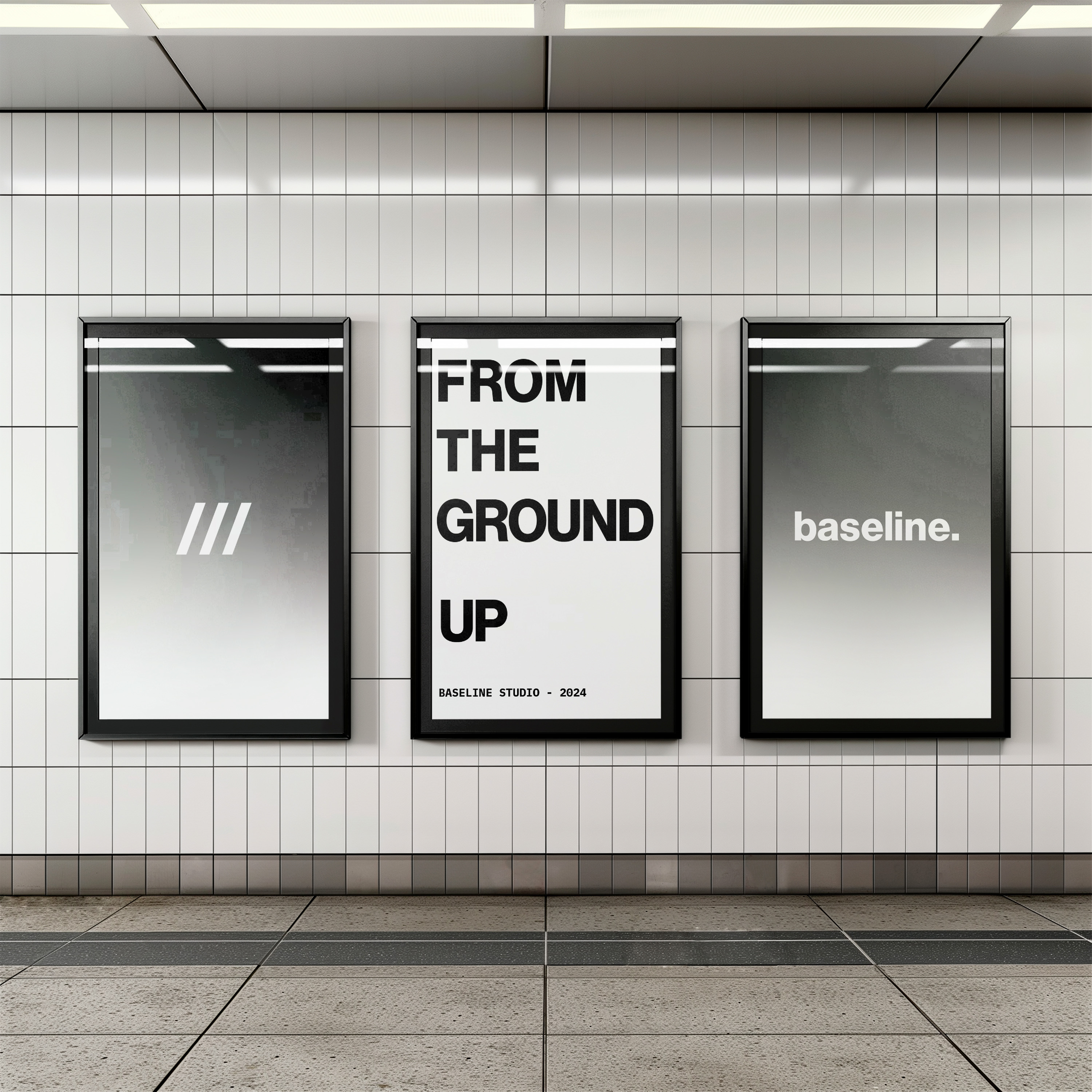
The final applications demonstrate what a system looks like when it is trusted. Billboard, business card, tote, digital, social. Five formats at radically different scales, all resolved with the same typographic logic, the same spatial discipline, the same restraint. Nothing is added to compensate for the change in format. The system holds because it was built to.
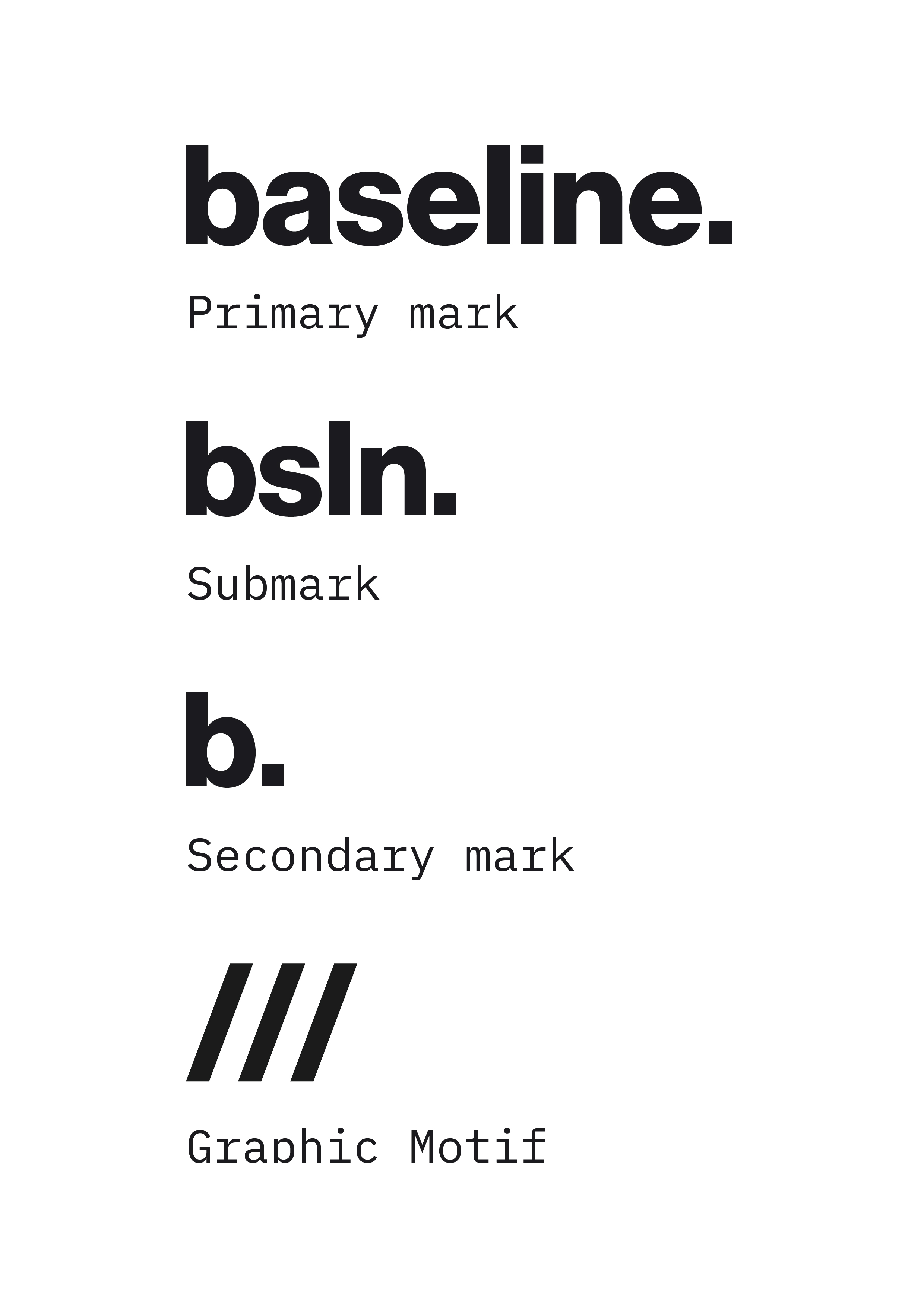
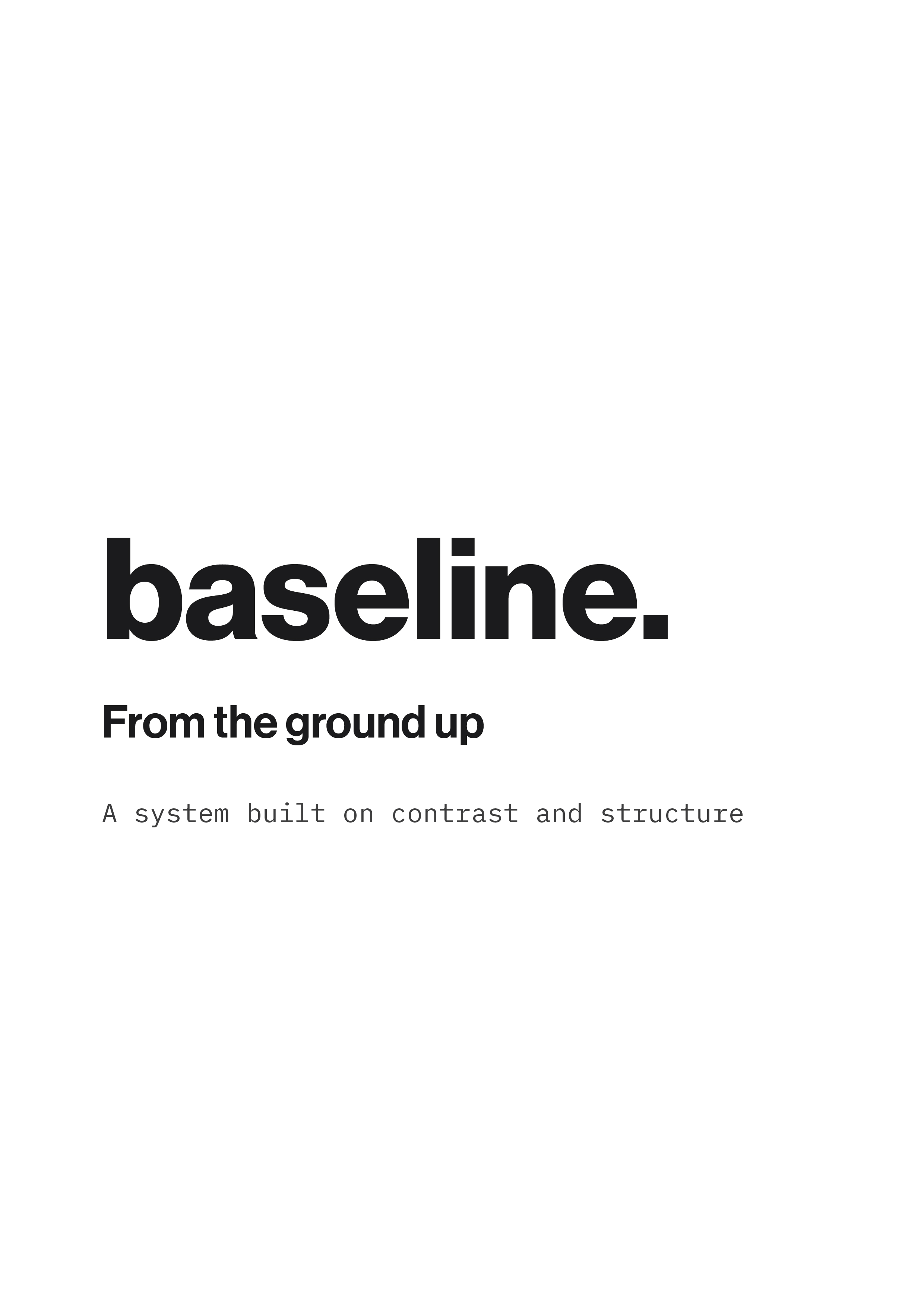
Four marks, each with a defined role, paired with the typographic system, Neue Haas Grotesk Display and IBM Plex Mono. Structure and contrast, working as one.
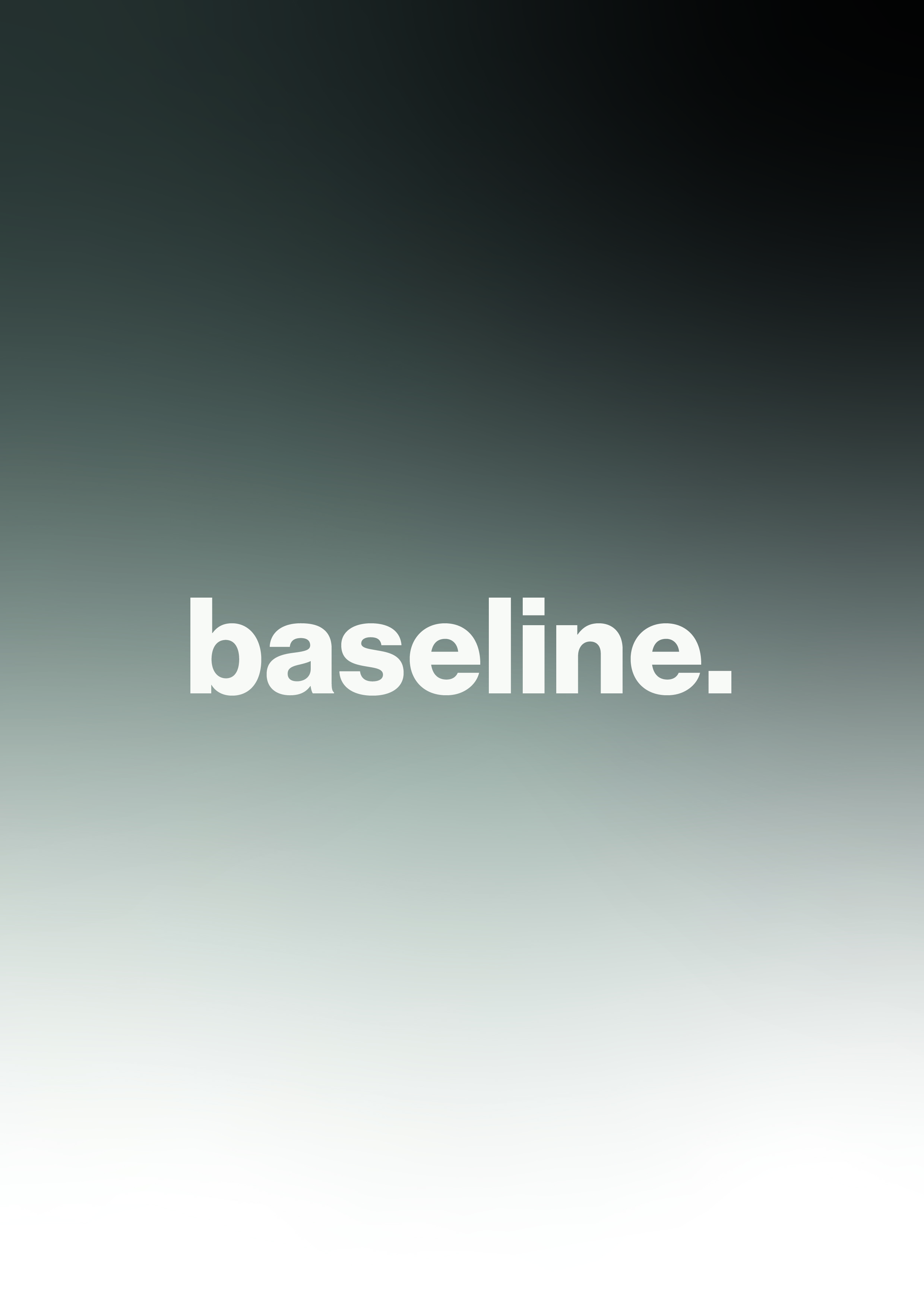
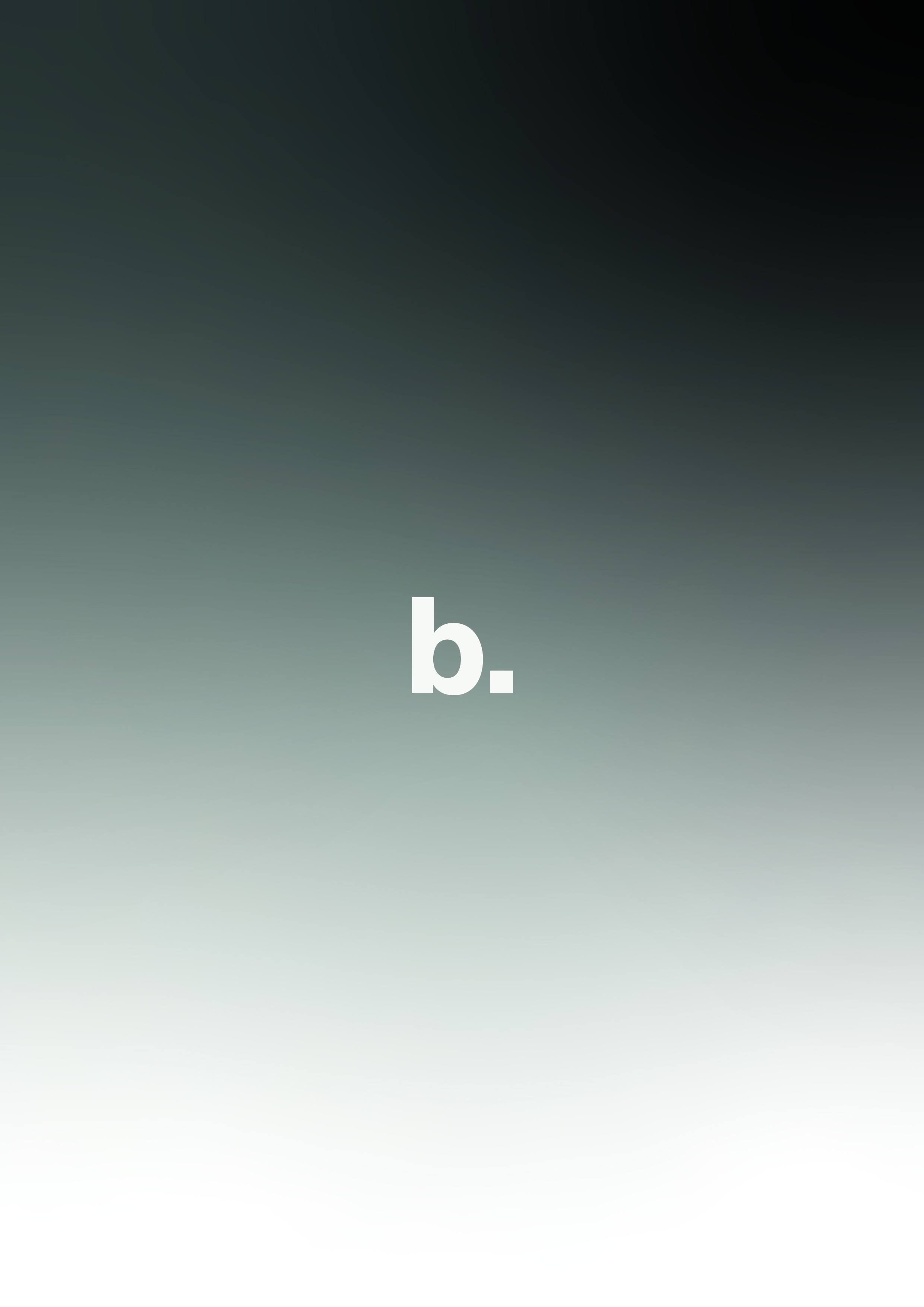
Tagline poster series. Gradient backgrounds establish depth, modular layouts demonstrate the grid in action. Each poster is a different composition built from the same set of rules.
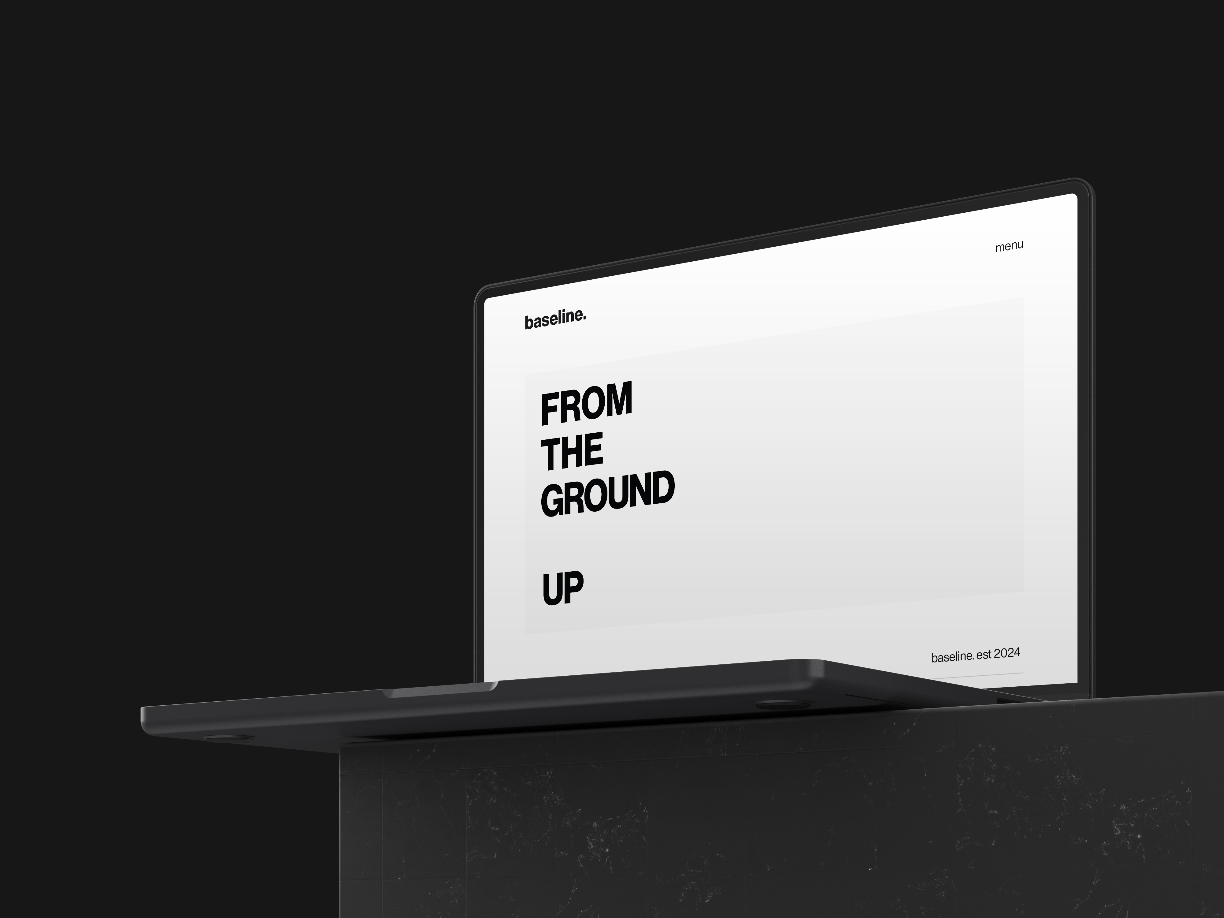
Digital application. Typography leads, space does the structural work. The transition from print to digital requires no adaptation because the system was built to work across both from the start.
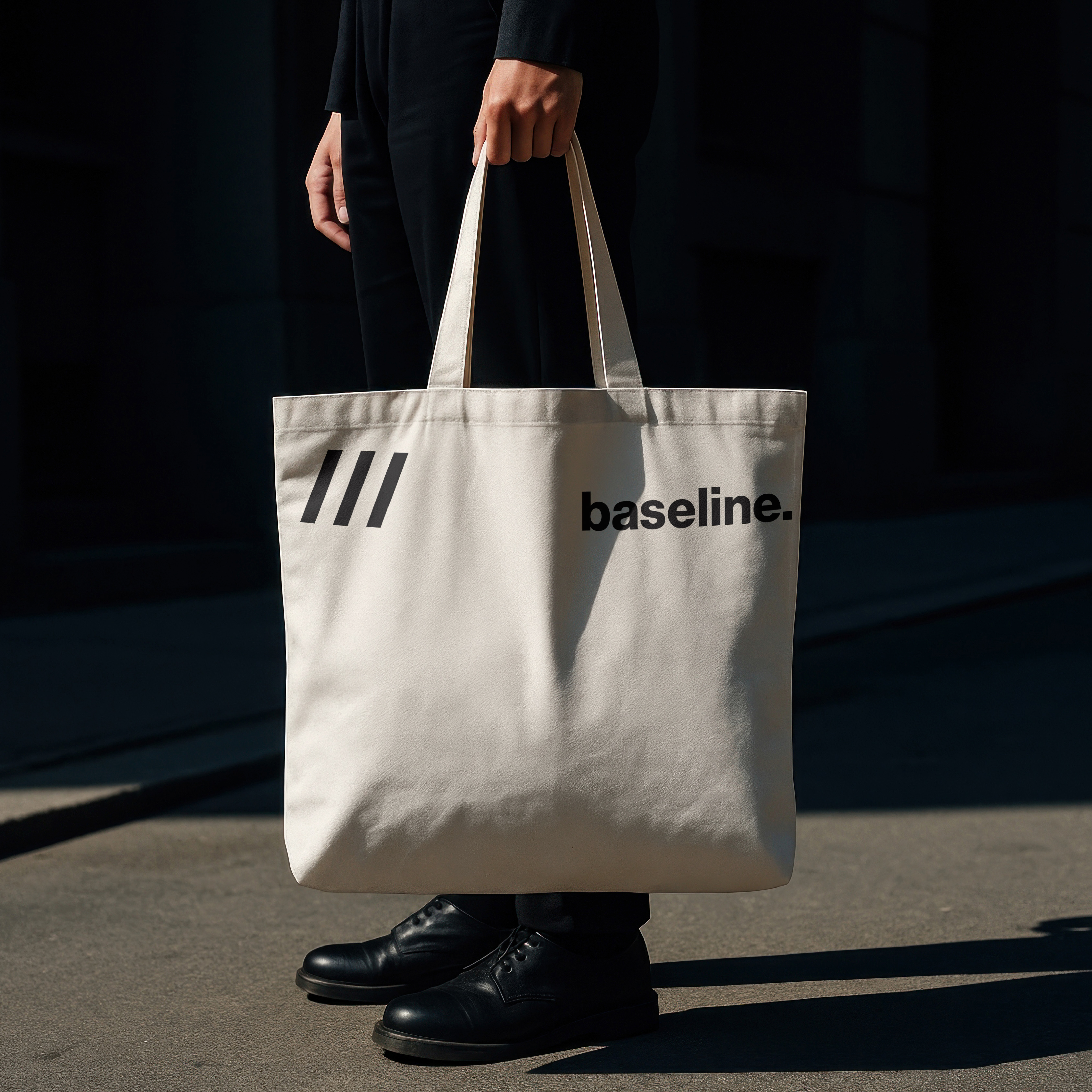
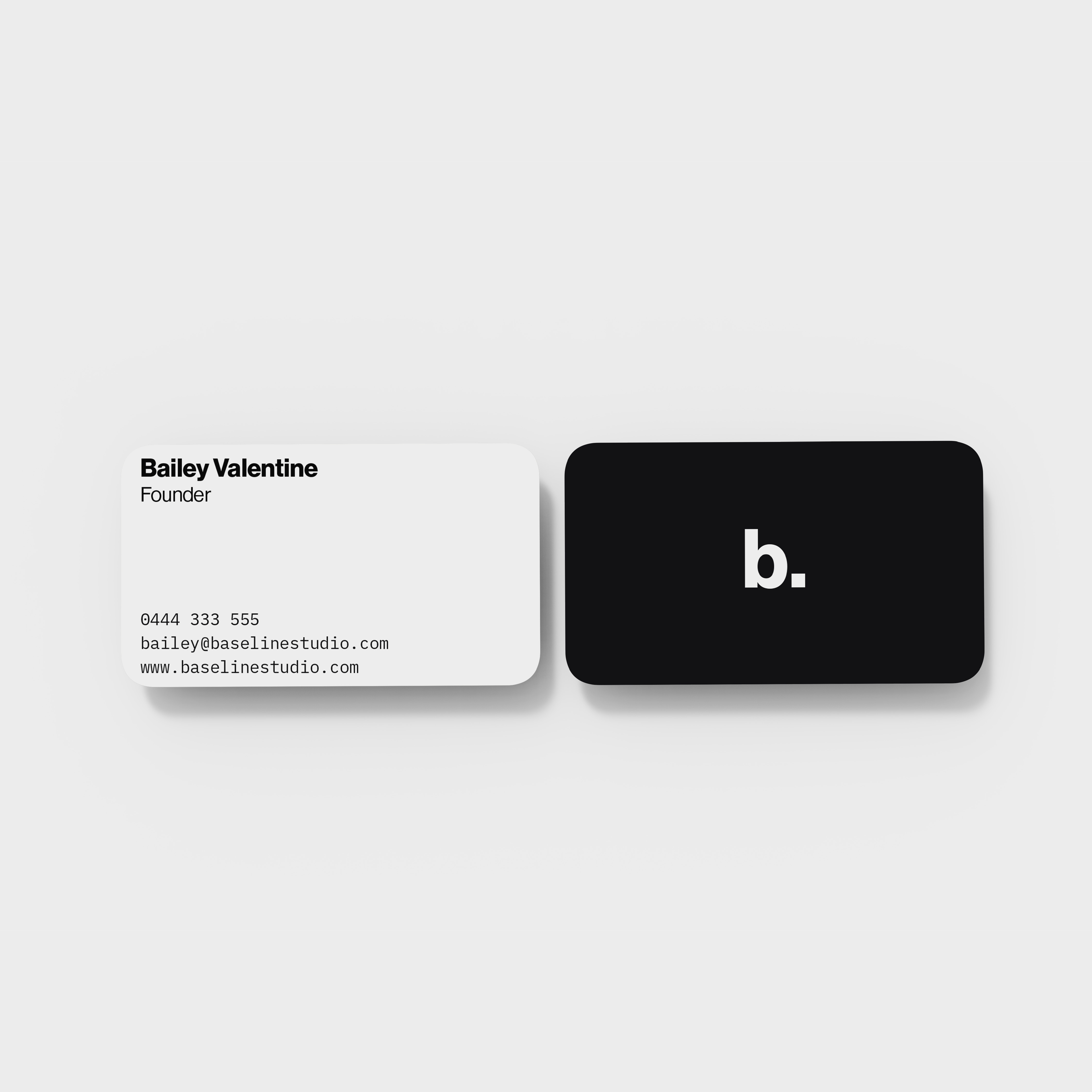
Social media system. The same typographic rules apply throughout. The system is trusted to work at every scale.
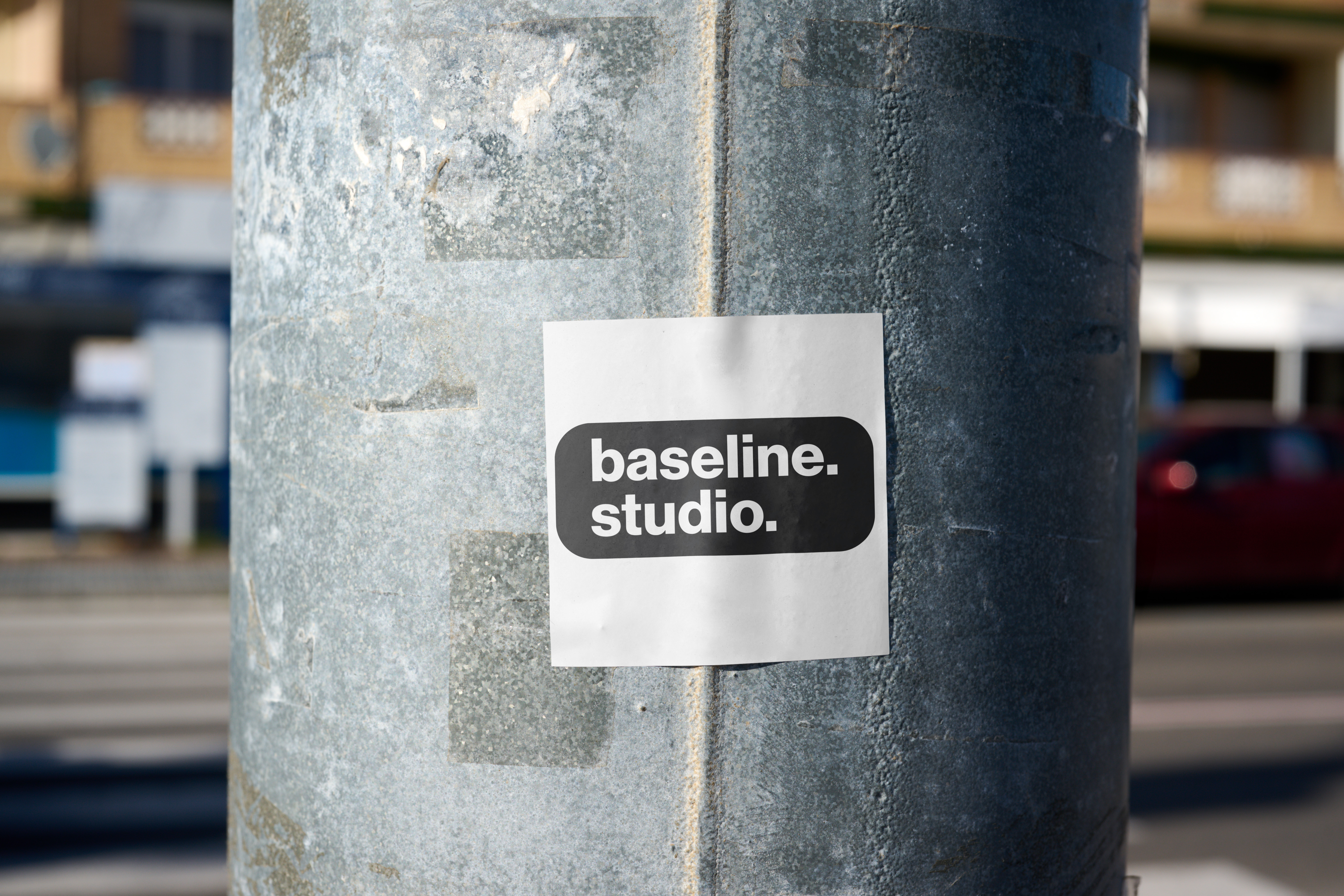
Sticker mockup. The identity at its most reduced and most direct. baseline. studio. on a pole in the street is still the system doing its job.