Brand Identity — 2025
ALTA is a concept brand identity for a premium tennis and performance club, exploring the intersection of athletic discipline and elevated lifestyle culture. The organising idea Everything Rises connects the geometry of the mark to a performance philosophy: progress is incremental, structural, earned.
Tennis club branding tends to lean on tradition crests, serif type, country-club heritage. ALTA needed to feel modern and performance-led without losing the gravitas the sport demands. The brief called for a system that could carry the brand from court-side signage to membership cards without losing its edge.
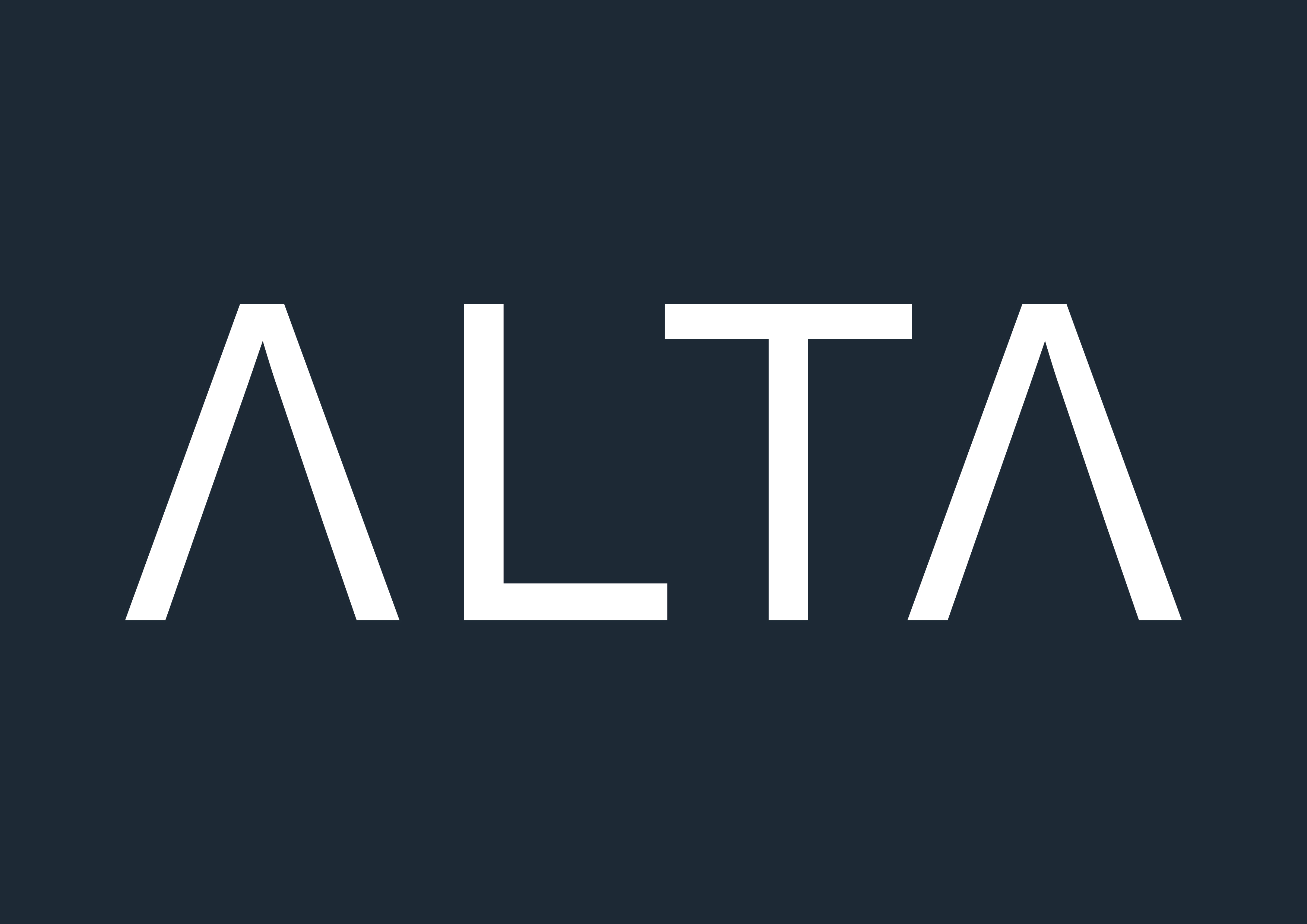
A custom wordmark with the crossbar removed from both A letterforms not a styling gesture, a structural decision. The open A reads as ascent. Combined with wide tracking, a two-colour palette, and a strict hierarchy between expressive and operational contexts, the system communicates discipline before anything else.
Wordmark, colour & type system, poster series, timetable, wayfinding, apparel, membership card, social media system.
The concept needed a single organising idea that could anchor every design decision, from the geometry of a letterform to the tone of a membership card. Everything Rises connects the upward geometry of the A mark to a performance philosophy. The phrase avoids the motivational-poster register deliberately it's a statement of how the system operates, not a call to action.
Neue Haas Grotesk Display was chosen for its neutrality and optical refinement at large scales. The crossbar was removed from both A letterforms making the upward movement of the mark literal without being illustrative, creating a proprietary shape that a standard typeface setting wouldn't produce. Tracking set wide; combined with the light weight, this gives the wordmark an architectural quality.
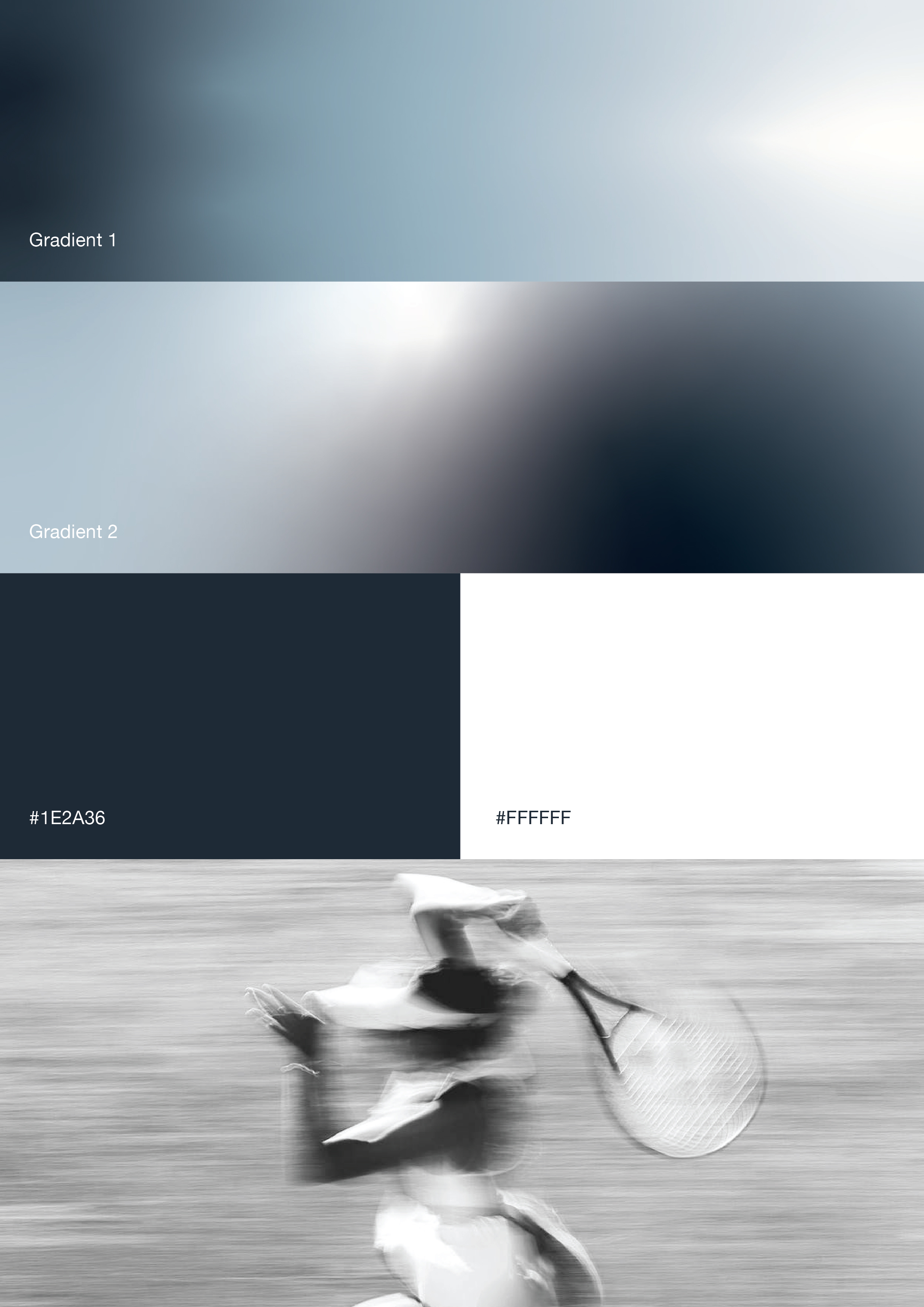
The system operates across two registers. The gradient palette cool blue-greys moving from near-white to deep teal-dark belongs to the campaign layer. Black-and-white motion photography provides the kinetic counterpoint. The core palette, ALTA Navy (#1E2A36) and White (#FFFFFF), anchors all operational touchpoints. No gradients enter these surfaces visual richness is reserved for moments of brand expression.
The identity was tested across campaign, digital, operational, and environmental contexts poster series, timetable system, wayfinding, apparel, and membership card. The identity doesn't adapt by compromising. It adapts by knowing which register it's in.
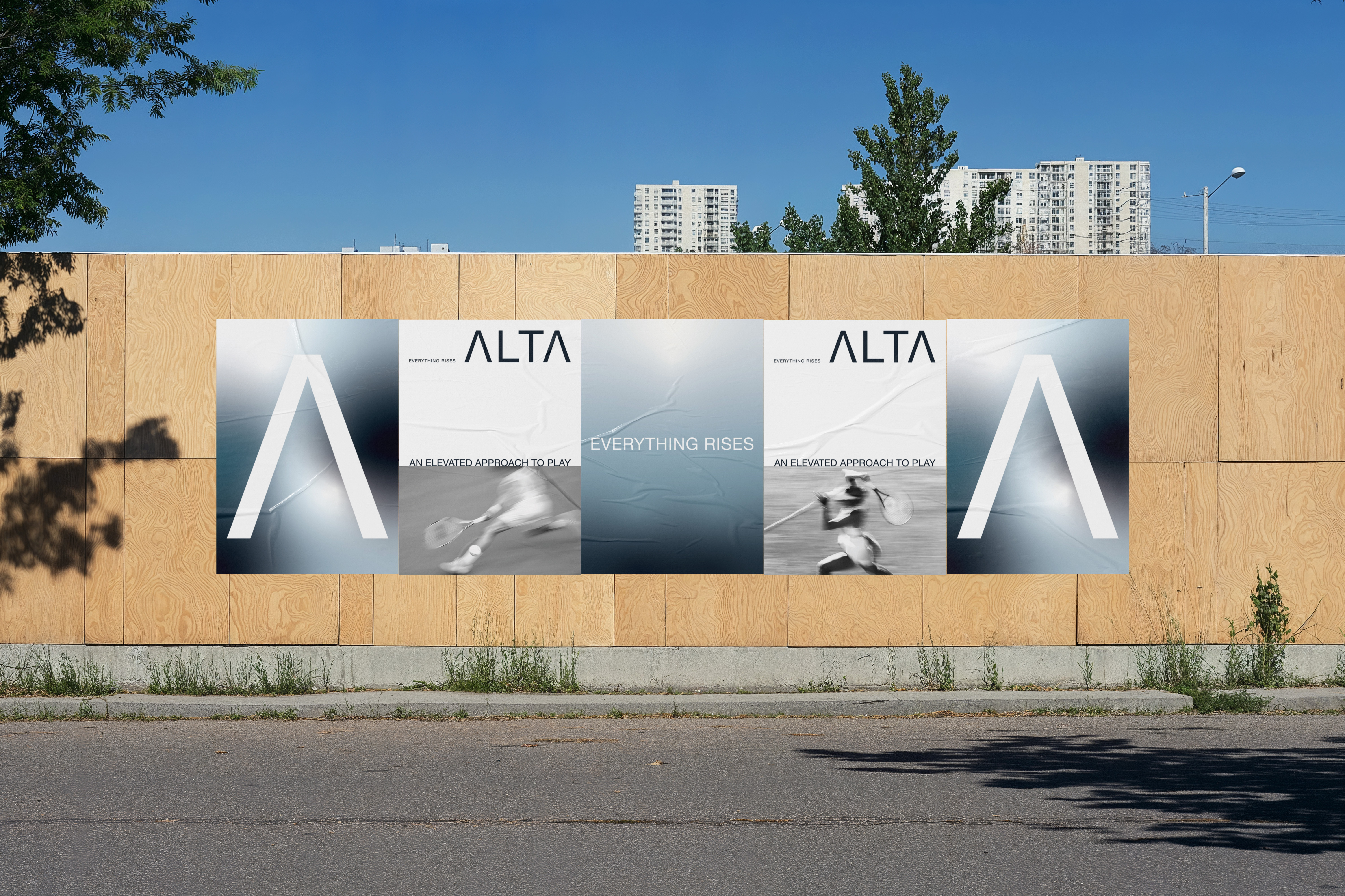
Poster series the brand at full expression. Each piece operates within the gradient system, cool atmospheric backgrounds, white typographic forms, the A mark used as a graphic device in its own right.
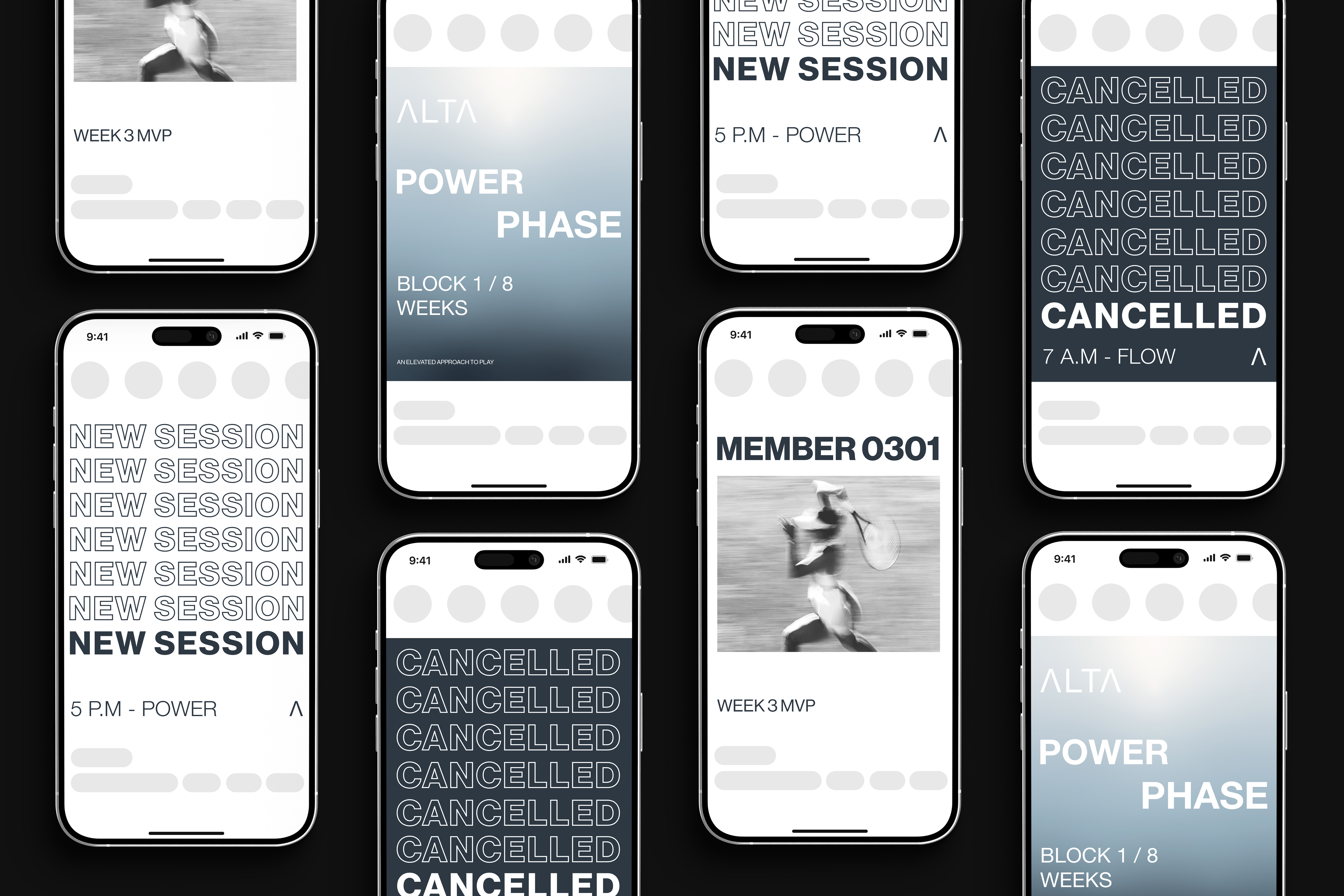
Social media system. The same typographic logic at reduced scale, the system trusted to work across every format.
Timetable system AM and PM sessions. Photography cycles beneath the grid, grounding each session in the physical environment of the club. Structure and image occupy the same surface without competing.
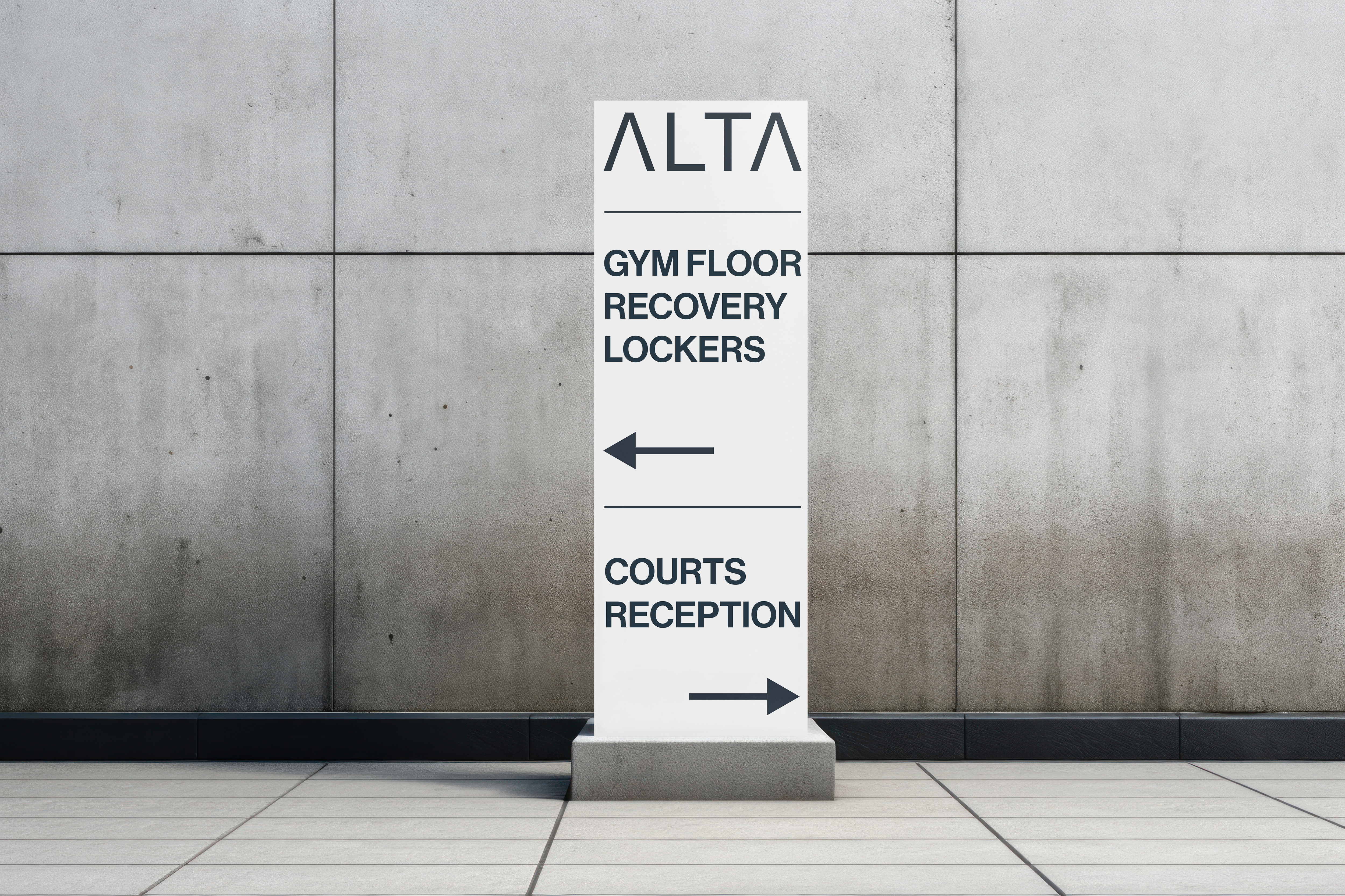
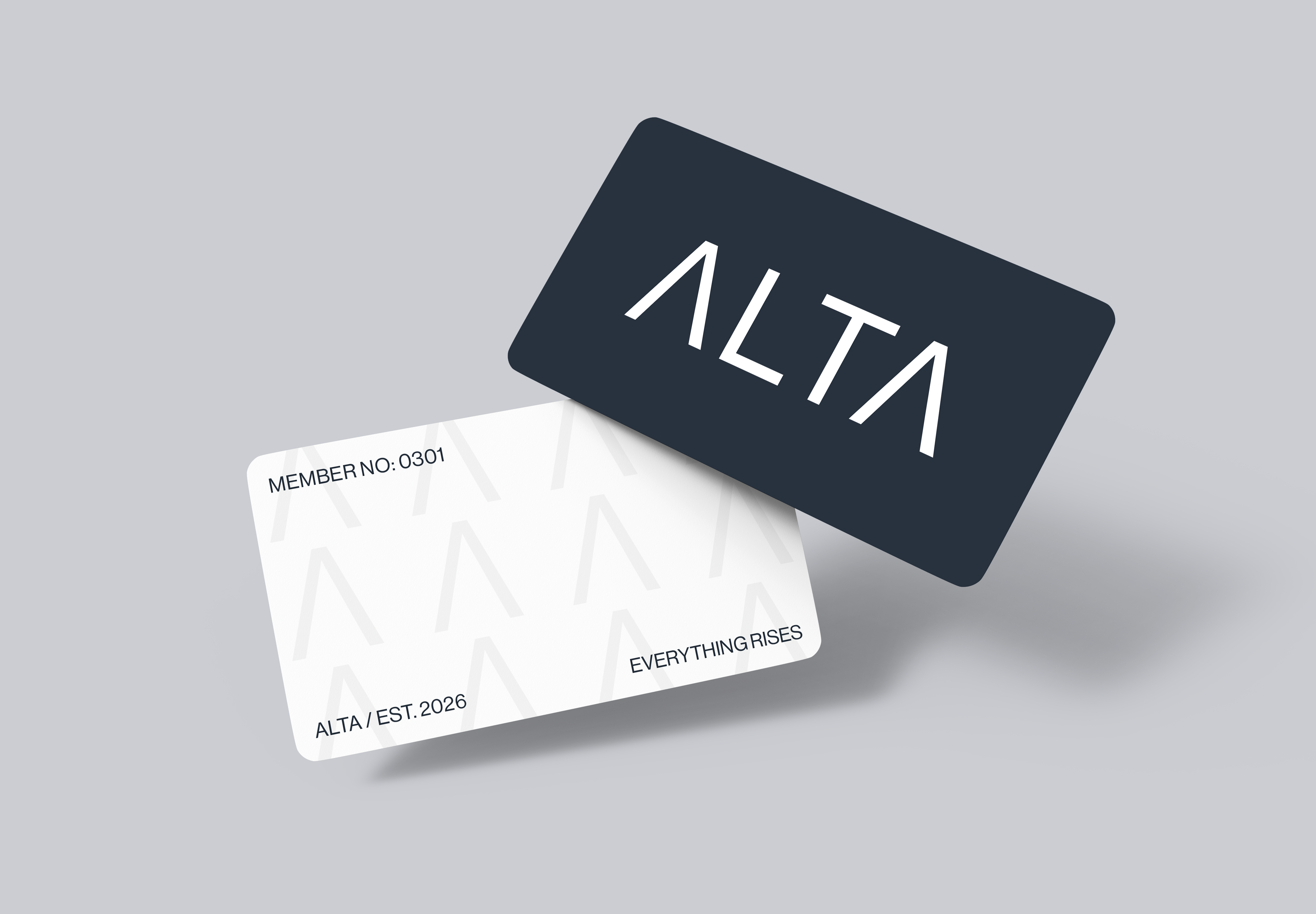
Wayfinding and membership card. Every sign is a reduction of the same rules Navy, white, and type. The membership card distils the system to its minimum viable form. At this scale every element has to earn its place.
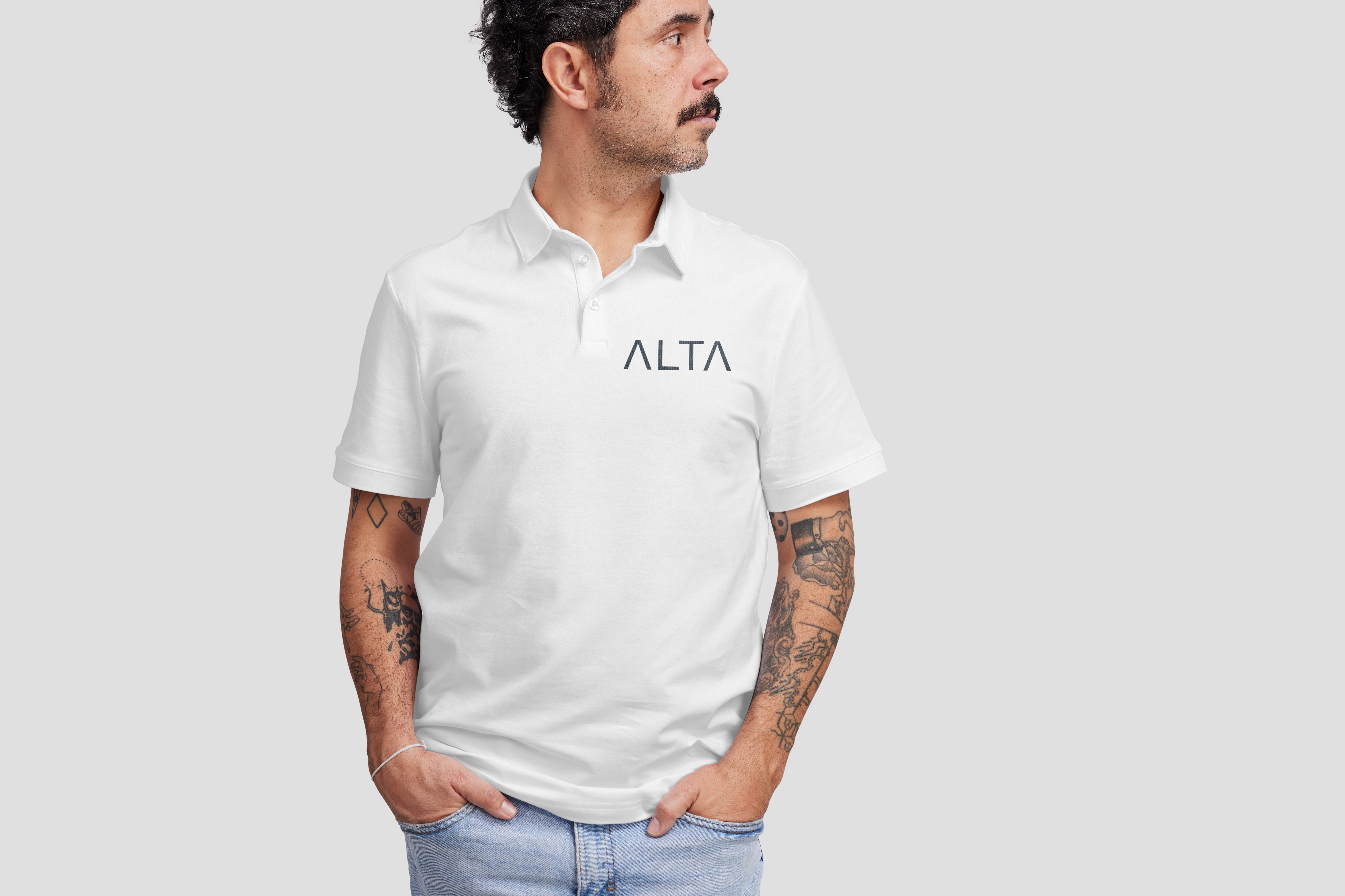
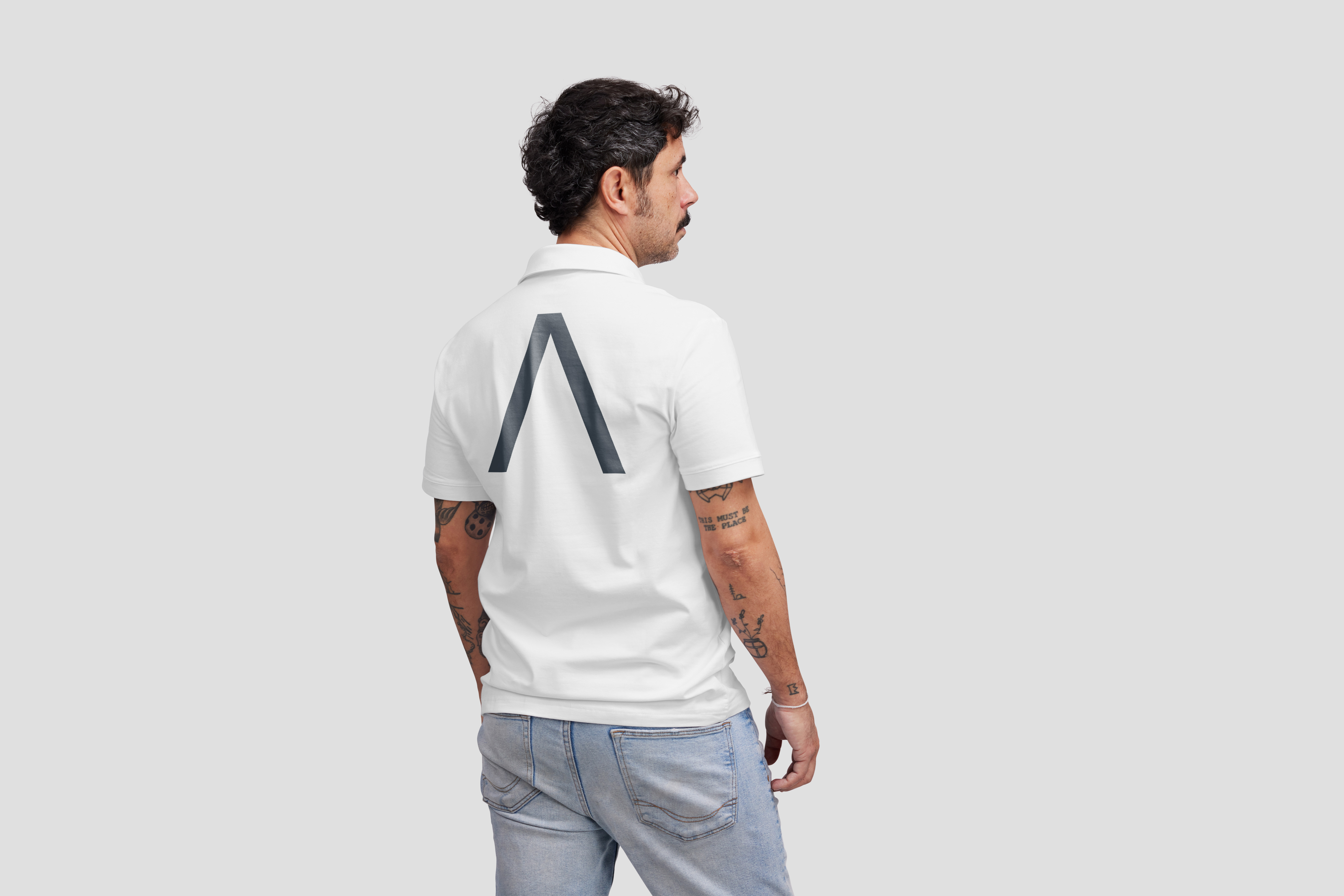
Apparel the uniform range represents the brand at its most reduced. The identity sits with the same discipline the club asks of its members.